How to present images of your products online for the interior designer market

i.d.space

By Carol Rutter
Interior designer at i.d.space interior design and Projects Director for The UK Interior Design Bureau.

View Profile ›

The Top Ten Do’s and Don’ts

The Top Eleven Do’s and Don’ts for manufacturers and suppliers on how to best show off your product, from an interior designer’s perspective.

So, you want to market your product to interior designers..

You may be just embarking on a campaign to promote your products to interior designers or you may have been aiming at this market for a while. You may be an owner-manager of a business or be working in the marketing department of a large corporation or even be its CEO.  The ideal outcome of all of your hard work in putting together product information and photographs for an interior designer audience is that your product will be seen, selected, specified and purchased. But, even if you have allocated very fair budgets to the marketing of products to this audience, it is possible to fall at the very first hurdle if your product is not correctly presented.

We all know that text must be readable on websites but understanding that images need to also be easily readable is a less decipherable mantra. Here, I go through some of the main points to consider when creating visual material for a creative specifier audience.

You may wince when you see, and possibly recognise, some of the common mistakes made in marketing to interior designers.  To help you, tips are included here on understanding some practical ways in presenting your product.

1. Crystal-clear mug shots

The best product image enables the interior designer to copy or download it and use it instantly for possible presentation to their client.

It is crucial to show a full shot of the product, singly, ideally from different angles with a plain, ideally white, background.   Use additional in-situ shots if you want to show how your product works in a design scheme but it is essential to allow the designer to view the product clearly and enable them to present it to their client without any other visual “noise”.

This is the wrong way to show a sofa product for interior designers and architects. The background confuses the product image. Props and styling make the presentation look "retail" and create too much visual "noise".
This is the wrong way to show a sofa product for interior designers and architects. The background confuses the product image. Props and styling make the presentation look “retail” and create too much visual “noise”.
The presentation of this Eames DSW chair is the wrong way to show a product for interior designers and architects. There is no single clear representation of the product and also it would be impossible to crop to obtain a clear, uninterrupted image. Interior designers are used to having to crop images to get what they want but this image would be impossible even to crop.
This is the wrong way to present a chair product to interior designers and architects – despite it being a great product, the Eames DSW chair, the image does not portray this or any of the detail of it and could not be used to present to a client. Only one angle is used and the product is not lit correctly.

Your presentation of your company and your product must be of the same high quality as your products themselves.  Using the best possible quality images to represent your product is crucial, which means they must be large and clear. It is important to remember that the majority of interior designers are primarily kinaesthetic, meaning that they are more stimulated by the sense of touch than any other sense, including that of vision. When interior designers create spaces for their clients their key focus is on how the space will feel and how it will affect their clients’ emotions.

So, bearing this in mind, you will understand why images of your products need to be of such high quality that they appear in an almost tactile way. So good in fact that the interior designer can feel as if they can almost touch and handle the product.

This is the wrong way to present your product to interior designers and architects. Even if it is just shown in this size on a page of multiple products the image is still too small for a creative specifier to assess the detail or finish.
This is the right way to present a chair product. There is a clear image of the product with a plain background. Eye-level perspective gives a clear indication of the whole product. This image can be copied or downloaded by an interior designer to be presented to a client or included in a specification document.
This is the right way to show a sofa product – singly, with a clear background. There is no prop-styling which detracts, or distracts, from the product and no background colour or detail which means the product can be rapidly assessed by a professional specifier.

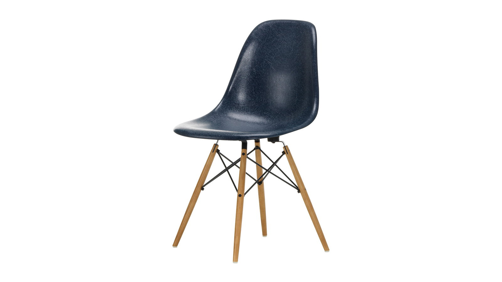
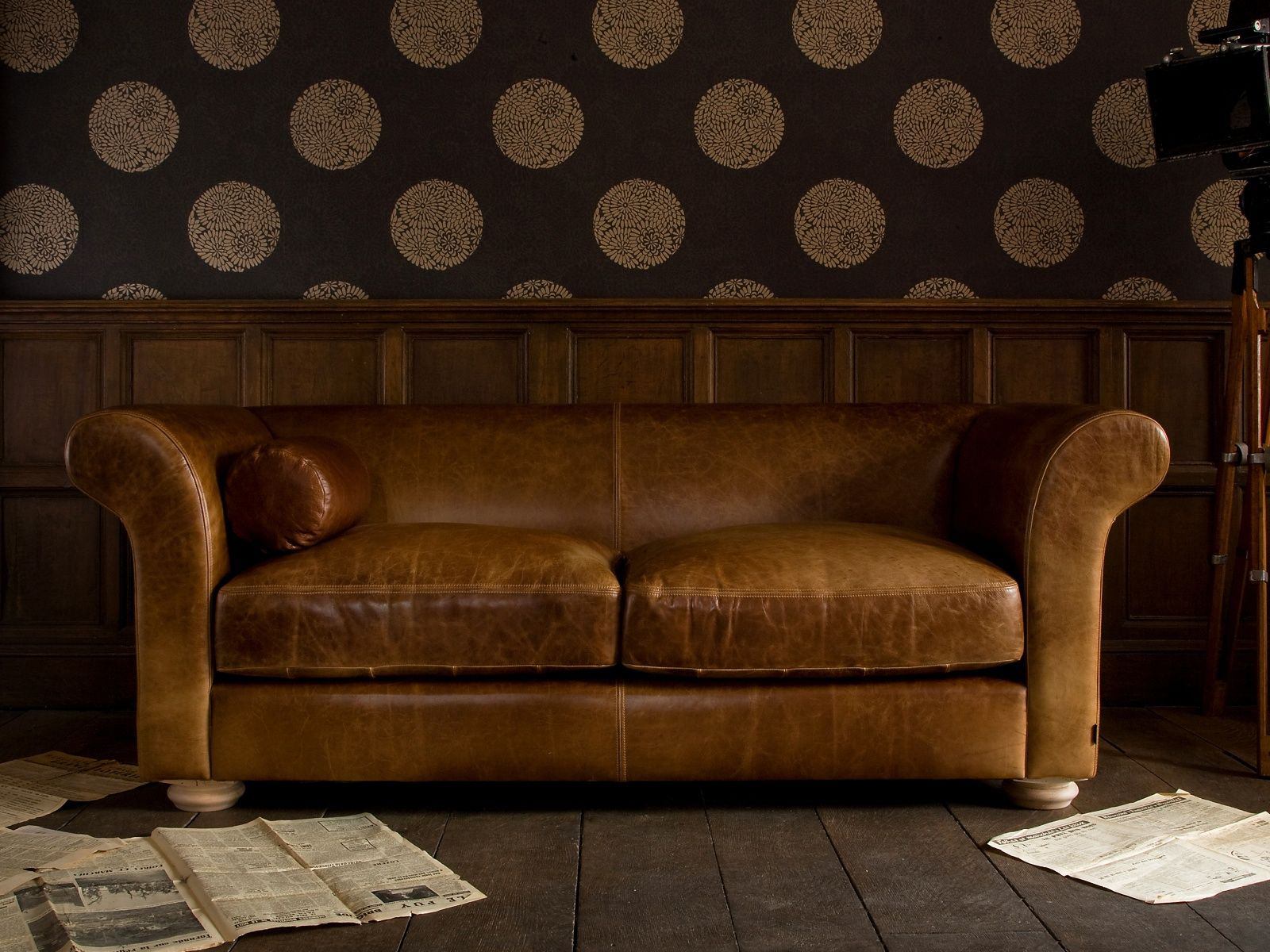
Shown is the Jenny High Back 3-seater sofa by Knightsbridge Furniture

2. Keep images clear of graphics or text

This is the wrong way to show a sofa product. The image has text/graphics included which shouts “retail” to a professional specifier. Most retailers are not set out for, or geared towards, serving professional interior designer customers so it is important not to appear as a retailer to a professional interior design audience.

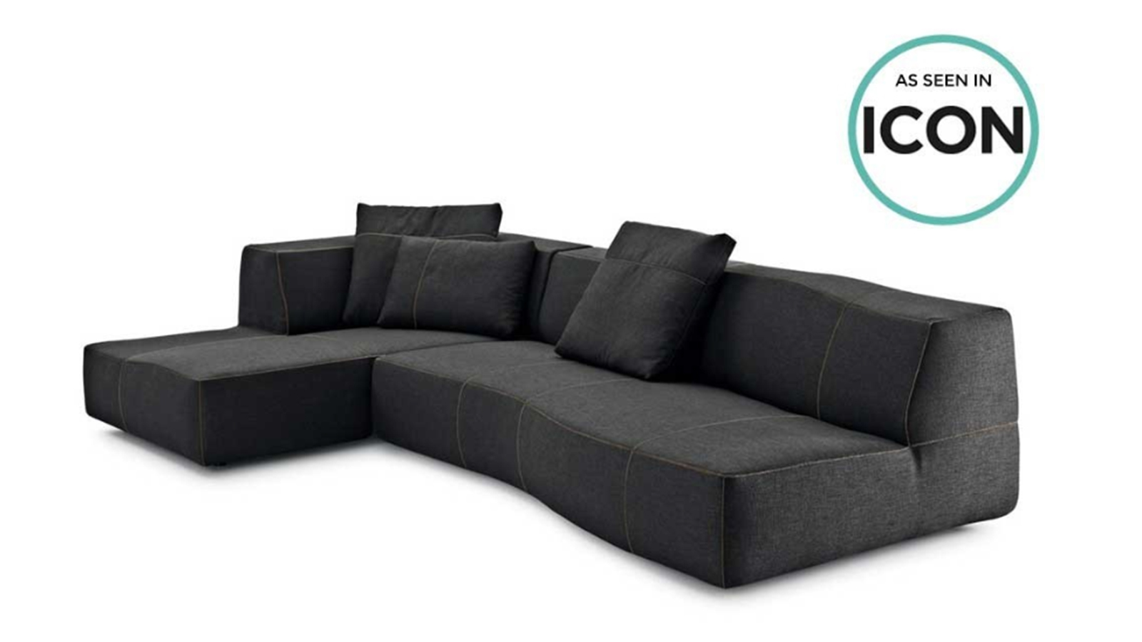
Although this product of the charcoal-coloured sofa above is shown in a neutral upholstery (which is great, if somewhat tonally dark/gloomy in colour) the graphic shows that this is a retail presentation of the product. An interior designer would not be influenced, or possibly even be aware of, ICON (which, as the graphic doesn’t explain, is a magazine) and would have to crop the graphic out of the image if they were to use it.

Cropping graphics out of a product image in order to show it to a client takes up additional, unnecessary time for the interior designer. Also, to this visually acute customer, the presence of the graphics, lettering and colours is disrupting to the rapid evaluation of the product that needs to take place when carrying out the sourcing and selecting process.

The subliminal message being sent by using graphics in this way is that this product is being promoted to a retail customer audience not a professional one. The interior designer could quickly conclude that the supplier is not geared towards, or wishing to, market to interior designers. This train of thought may easily continue to thinking that the supplier probably won’t offer suitable customer service or very good trade prices either (most retailers don’t) and so the designer simply moves on to look elsewhere.

This image might have some useful information written across it. But it is the wrong place for text and this text is too small and faint to read anyway. And can you even tell what the product is? (It is a tap). For a creative specifier trying to assess a product to see if it is suitable to select and be put forward to a client, this image will be not only useless but an obstacle. Seeing it is wasting the interior designer’s time.
This is the wrong way to visually present a product – This image might have some useful information written across it. But it is the wrong place for text and this text is too small and faint to read anyway. And can you even tell what the product is? (It is a tap). For a creative specifier trying to assess a product to see if it is suitable to select and be put forward to a client, this image will be not only useless but an obstacle. Seeing it is wasting the interior designer’s time.

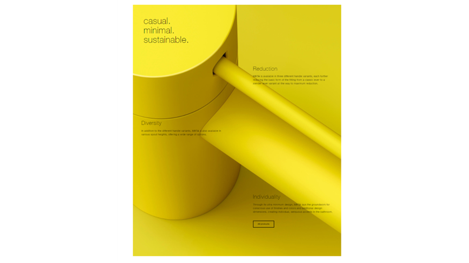
The yellow product image above is a striking image, there is no doubt. But it doesn’t show the product in its entirety and cannot be used for a client presentation as it has text across it. Again, the subliminal message is that this product is being promoted to a retail customer which, you may have gleaned by now, is a methodology that is not compatible with serving a professional interior designer customer.

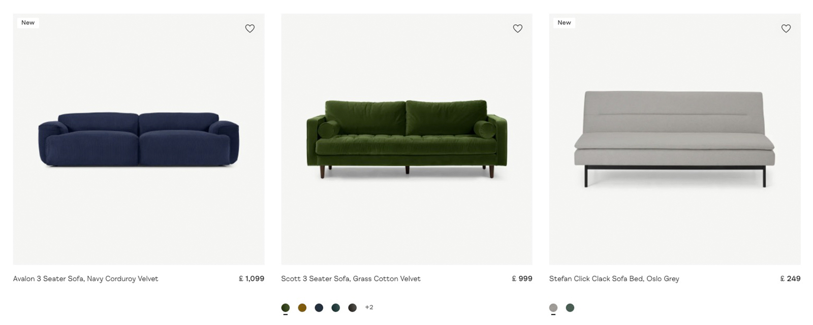
3. Ensure you are presenting in a format that is industry-correct for your market

Retailers, of course, advertise their prices, but in the contract market this is not the practice. Instead price lists will be provided to the customer along with specific quotations for the product. To display prices next to your product indicates that you are aiming at the consumer, not a trade customer. Retailers are unfortunately known to not generally provide a good service to interior designers or reasonable trade prices so this type of presentation would be a deterrent to an interior designer seeking to specify products.

Including prices with the product image is again a retail presentation. Contract furniture is not presented with a price. These sofas, presented with their prices, are typical of a retail format which is likely to repel a professional specifier.
This is the wrong way to visually present a product – Including prices with the product image is again a retail presentation. Contract furniture is not presented with a price. These sofas, presented with their prices, are typical of a retail format which is likely to repel a professional specifier.

4. Keep images stable, constant and readable

It is the mode on today’s websites to have images that jump, shimmer, fade in or out, expand, disappear, shape-shift or suddenly manifest text (which wasn’t there before) when you hover over them. All of these techniques, which may be a display of the genius of the web designer, are obstacles to an interior designer trying to assess and select a product to go forward to presentation to a client.

Here, I will walk you through a typical example of how this happens. The ideal outcome when an interior designer views an image of your product is that they can instantly read the product depicted and, if interested, move on (by clicking if necessary) to see more detailed data on the item.

I really like the product on the right but when I put my cursor over it to get a closer look…
…it changes to this (shown above)! As an interior designer I can no longer see a clear, single representation of the product but am looking at a prop-styled image with an incomplete representation of the product - all of which creates a lack of clarity in “reading” the product image.  By keeping images, and expectations, consistent you will be enabling the interior designer in pursuing and selecting the product they first saw.
…it changes to this (shown above)! As an interior designer I can no longer see a clear, single representation of the product but am looking at a prop-styled image with an incomplete representation of the product – all of which creates a lack of clarity in “reading” the product image. By keeping images, and expectations, consistent you will be enabling the interior designer in pursuing and selecting the product they first saw.

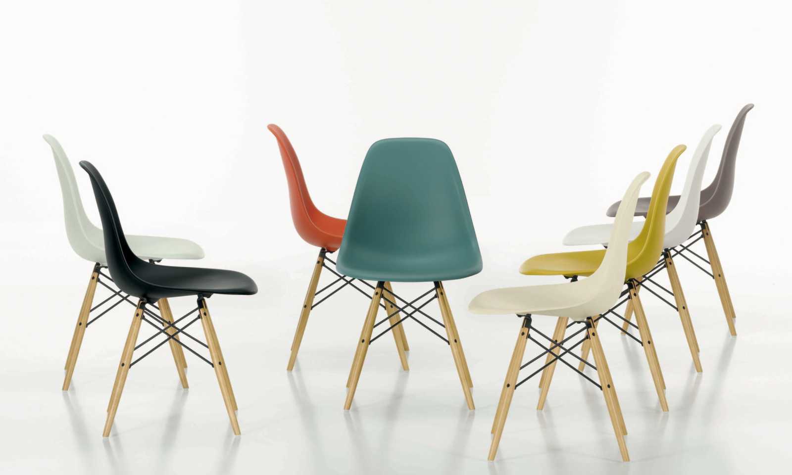
5. Keep image presentation consistent – consistent images are readable images

The product images shown above of light switches, although a charming product, are hard to scan through quickly as it is hard to “read” them and move on to the next – each product is presented at a different angle which causes the viewer’s brain to turn similar somersaults in deciphering the product.
This is the wrong way to visually present a product – The product images shown above of light switches, although a charming product, are hard to scan through quickly as it is hard to “read” them and move on to the next – each product is presented at a different angle which causes the viewer’s brain to turn similar somersaults in deciphering the product.

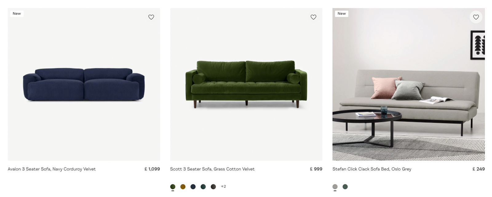
Inconsistent product images take much longer for a creative specifier (and anyone) to assimilate and assess. The images shown here are shown at various angles. For a creative specifier to be able to scan through images, they need to be consistent in angle, lighting and style.

Products set out consistently in angle, style and colorisation make it easy for creative specifiers to scan and select products at a high speed and get their job done more easily.
This is the right way to visually present a product – Products set out consistently in angle, style and colorisation make it easy for creative specifiers to scan and select products at a high speed and get their job done more easily.

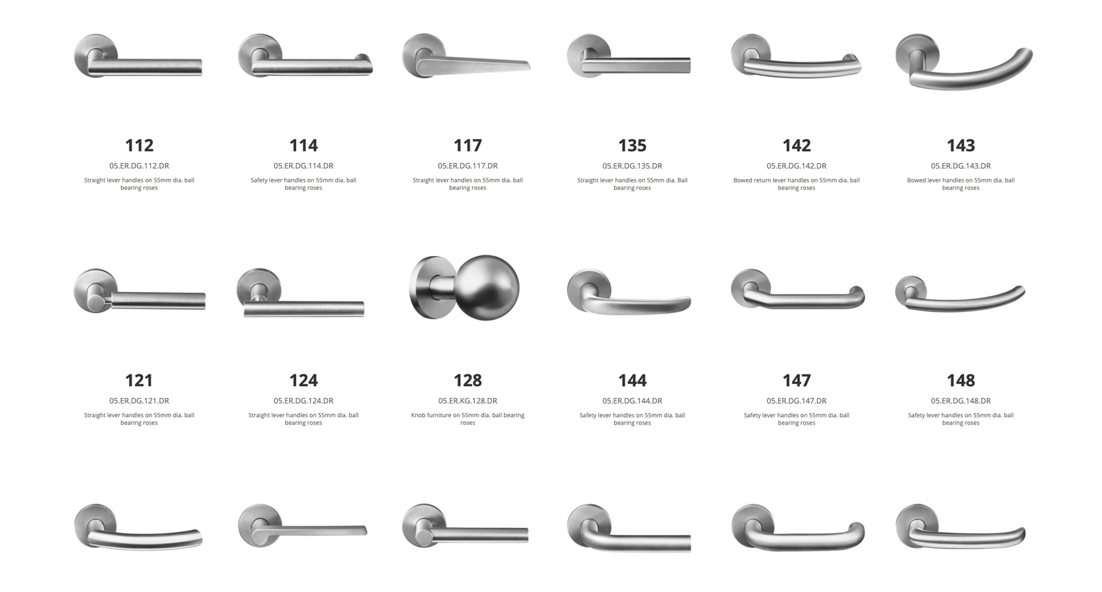
This is the right way to visually present a product – Above you can see images of these lever-handle products by 3V Architectural Hardware are set out in a completely consistent way, it takes only seconds for a creative specifier to scan through pages of these and assess. The images are consistent in photographic angles, colorisation, size and style with the added benefit of having a non-distracting plain white background.

6. Ensure the image shows the whole product, is in focus and aligned

This image of a black tap in a dark setting is not only very difficult to read but a basin in the foreground masks the base of the product. Not only does this make it hard for a creative specifier to assess the product but this image could not be put forward as part of a presentation to a client.
This is the wrong way to visually present a product – This image of a black tap in a dark setting is not only very difficult to read but a basin in the foreground masks the base of the product. Not only does this make it hard for a creative specifier to assess the product but this image could not be put forward as part of a presentation to a client.

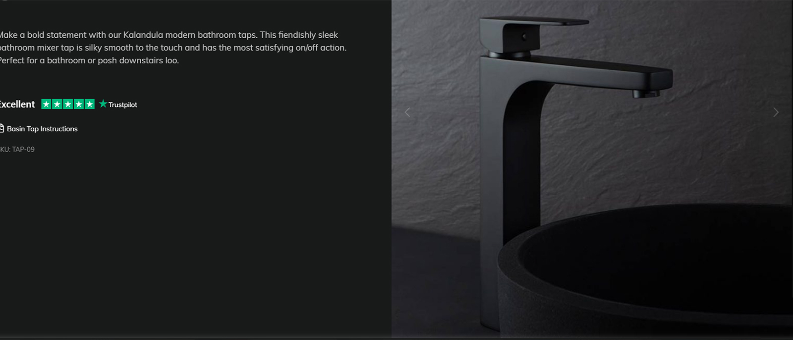
Above you can see an image of a mixer tap presented in such a way that it is very hard on the eye to try and decipher the product. The lovely big space on the left could have been used to display clearer images or product detail but instead an emotive description has been given. This product could genuinely be of interest to a creative specifier but too many obstacles have been put in the way both in assessing the product for its suitability and being able to present it to a client. Imagine the ink that would be use printing that out!

The verticals in this image of an invisible socket are not quite aligned which makes it disturbing to look at for visually acutely sensitive people. Even if it is subconscious this detail could be enough for a professional specifier to skip specifying this product.
This is the wrong way to visually present a product – The verticals in this image of an invisible socket are not quite aligned which makes it disturbing to look at for visually acutely sensitive people. Even if it is subconscious this detail could be enough for a professional specifier to skip specifying this product.

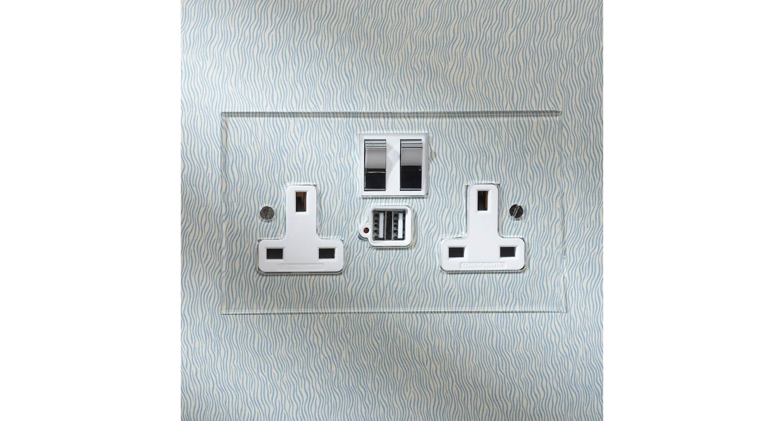
If you are showing your product face-on then ensure that your verticals are vertical and that the image is aligned accordingly. As you can tell this image, above, of an electrical socket is slightly out which, from just having a visually disturbing effect can lead to this product not being selected for presentation to a client.  

The image of this dimmer switch plate is partially out of focus which makes it hard for a creative specifier to evaluate the product. An image like this would not be suitable to present to a client or insert into a specification document as it does not present the image in its entirety or in full clarity.
This is the wrong way to visually present a product – The image of this dimmer switch plate is partially out of focus which makes it hard for a creative specifier to evaluate the product. An image like this would not be suitable to present to a client or insert into a specification document as it does not present the image in its entirety or in full clarity.

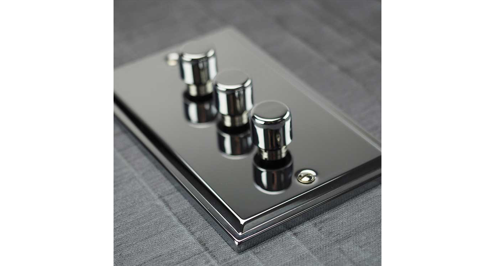
This dimmer plate with dolly switch, above,  looks like it is a lovely product however the photography style means it is unlikely to be presented to a client or included in a specification document. The dimmer knob in the fore-part of the image is in focus however the middle and rear of the product is shown out of focus. This means that the creative specifier cannot assess the product in its entirety.

The image of this light switch is disrupted by lighting and shadow and does not give a clear, readable, representation of the product.
This is the wrong way to visually present a product – The image of this light switch is disrupted by lighting and shadow and does not give a clear, readable, representation of the product.

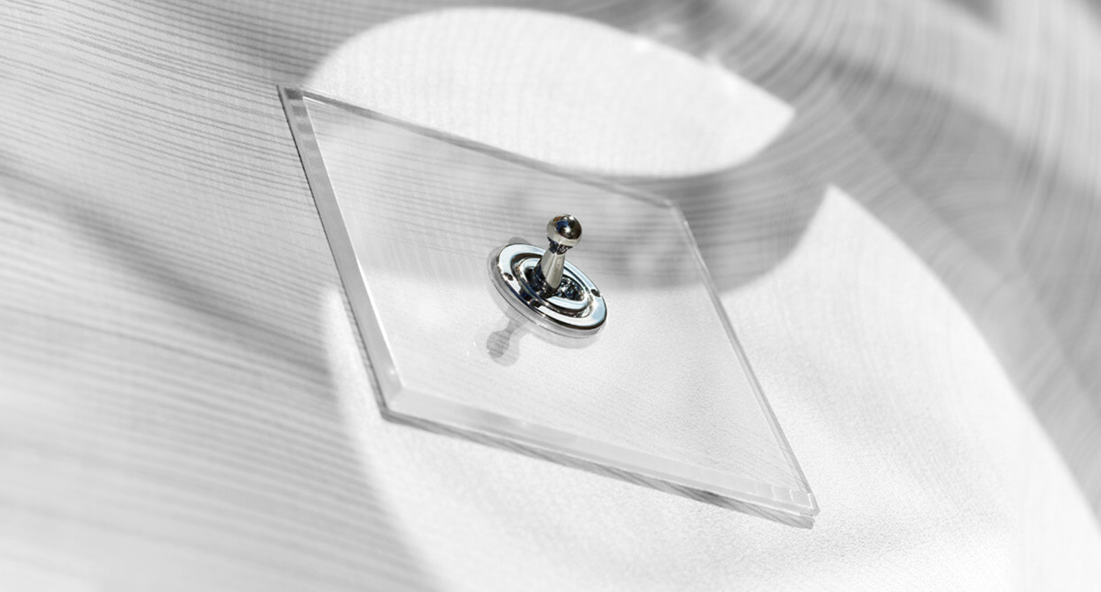
Again, the invisible dolly switch product shown above looks like it is very attractive but the photography style is working against its readability. The angle of the shot means the creative specifier cannot assess the product as it would be seen on a wall and the many shadows cast across it create a lack of clarity within the image. Additionally the corner of the product nearest the camera is out of focus.

Here is an example of how to visually present a tap product, this is the JDL DB Monobloc Mixer tap DB1650 in Double Stone Steel PVD coloured stainless steel Copper Brush. These images have a plain background and the tap is shown in its entirety from different angles.
This is the right way to visually present a product – Here is an example of how to visually present a tap product, this is the JDL DB Monobloc Mixer tap DB1650 in Double Stone Steel PVD coloured stainless steel Copper Brush. These images have a plain background and the tap is shown in its entirety from different angles.

7. Wherever your product appears – ensure its product name and code does too

Here a product image has been used but without any associated detail telling us what it is. This is a major missed opportunity as this very product could be of interest to an interior designer who may land on this page for a couple of seconds but not continue on the website, for any reason, to find out what it is.
This is the wrong way to visually present a product – Here a product image has been used but without any associated detail telling us what it is. This is a major missed opportunity as this very product could be of interest to an interior designer who may land on this page for a couple of seconds but not continue on the website, for any reason, to find out what it is.

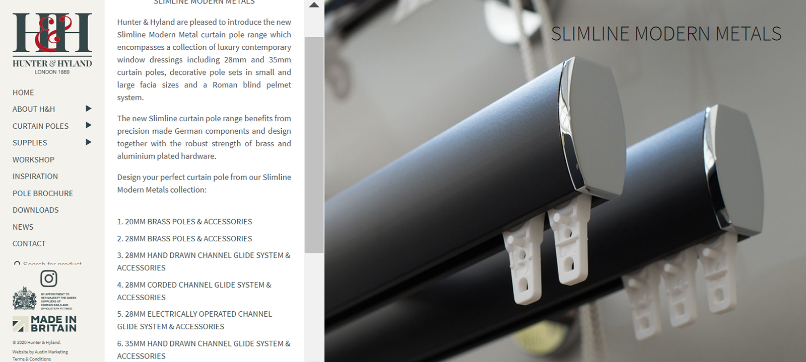
It is tempting to have a nice Hero image without any text however an interior designer landing on the page, shown in the above screen grab, would be stumped as to what the product is. There is no name or reference and the title “Slimline Modern Metals” refers to an inhouse collection and is generic – so how does the interior designer find the lovely product? Don’t take any chances, don’t leave your customer guessing what the product is – whatever page the interior designer lands on – make sure every product is identified and has the product data adjacent.

Above you can see a “Hero image”, this was used as the header for a product page for Double Stone Steel PVD coloured stainless steel. You will also see that all of the product detail is given in the caption below the image. Even if a creative specifier were only to see this section of the web page they are left in no doubt as to the product identity.
This is the right way to visually present a product – Above you can see a “Hero image”, this was used as the header for a product page for Double Stone Steel PVD coloured stainless steel. You will also see that all of the product detail is given in the caption below the image. Even if a creative specifier were only to see this section of the web page they are left in no doubt as to the product identity.

8. Present a realistic representation of your product (aka don’t try to be arty)

In the hands of marketers, graphic or web designers urging you to create sexy images of your “mundane” product it may be easy to cave in and let them create some artistic representations of it. You may even feel yourself that your product is not interesting enough in its own right and that its presentation needs to be enhanced in some way.

But it is important to remember that your product is not boring to the interior designer, it is of crucial and vital interest just as it is.

This product (it is a tap) is indecipherable from this image. Even if you worked out that it is a tap, you cannot see it in its entirety or assess its proportions.
This is the wrong way to visually present a product – This product (it is a tap) is indecipherable from this image. Even if you worked out that it is a tap, you cannot see it in its entirety or assess its proportions.

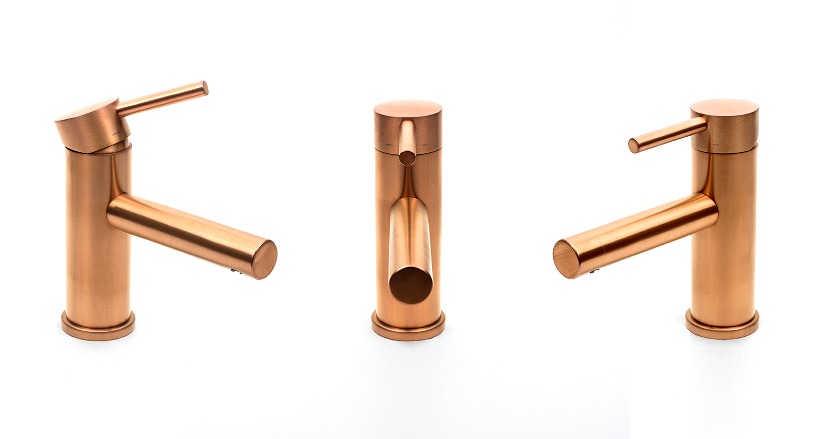
The product image above falls short on several fronts, it is a partial image (it is a tap) but you cannot see the far right of the product or the base of the product. The blue coloration moving into grey – does this denote something? If so, what? Is it a two-tone tap? Are the lever and the spout really that long or is it just a way of demonstrating the grey colour? A product image should not provoke so many questions, instead its purpose is to give visual answers.

A creative specifier can land on any page on any image on your website – may be only or a second or two. If you are targeting this customer then make sure every image is readable and that product data is adjacent. Ideally you want the creative specifier to be pulled forwards in their product search, not hindered by unsuitable and unhelpful images which may even serve to send them away from your website.

9. Only present images of products and finishes that you actually offer

This image looks like an exciting range of colours available for an architectural hardware supplier however this range of colours is not actually available. Instead the colours available are those shown above, bottom – only six of the twelve shown at the top. Presenting products or finishes that are not actually available might seem like clever marketing but it could stop an interior designer revisiting your website for years.
This is the wrong way to visually present a product – This image looks like an exciting range of colours available for an architectural hardware supplier however this range of colours is not actually available.
Only six of the twelve shown at the top. Presenting products or finishes that are not actually available might seem like clever marketing but it could stop an interior designer revisiting your website for years.
This is the wrong way to visually present a product – These are the six finishes that are actually available from this supplier, not the twelve shown above. Presenting products or finishes that are not actually available might seem like clever marketing but it could frustrate a creative specifier to the point where they might not revisit your website for years.

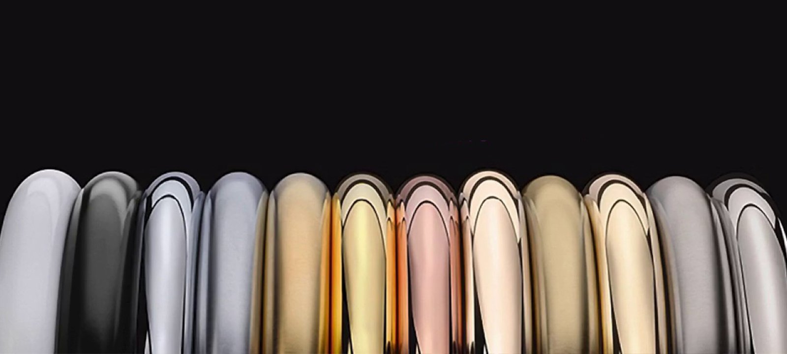
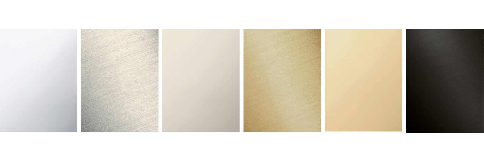
A little bit of artistic licence can make your colour range look so much more appealing – does this sound reasonable? I was sent a promotional email that included this range of finishes/colours for tap products. I clicked through to the supplier’s website and searched fruitlessly for products in these finishes. Eventually I contacted the sales rep to ask where I could see products in these colours.  He told me they don’t exist. Of these twelve colours shown only six are available and the presentation of these on the supplier’s website is as shown below. The sales rep appeared to be justifying this as a marketing tactic but I felt embarrassed for him. Tactics like this cast a shadow of doubt over more than just the colours available but over the ethics and honesty of the company. In short, don’t present images of something you don’t offer.

Sure, using this tactic, you may lure in a creative specifier once to look at an appealingly broad range of products and finishes, but if it then transpires that you are not able to offer these you will have successfully repelled the specifier, probably for ever.

10. Use real-life photography – not room-sets

The images above are propped room-sets to demonstrate the colours of a paint product. This format will be familiar to anyone who has looked for paint colours however it is a distinctly retail style of approach. Images like this serve no purpose to a creative specifier as the colour rendition, being manipulated is not a realistic representation of how the colour performs within a space. There is no natural lighting or shadow and even the give-away “eye-dazzle” effect where the edge of a photoshopped area meets an object.
This is the wrong way to visually present a product – The images above are propped room-sets to demonstrate the colours of a paint product. This format will be familiar to anyone who has looked for paint colours however it is a distinctly retail style of approach. Images like this serve no purpose to a creative specifier as the colour rendition, being manipulated is not a realistic representation of how the colour performs within a space. There is no natural lighting or shadow and even the give-away “eye-dazzle” effect where the edge of a photoshopped area meets an object.

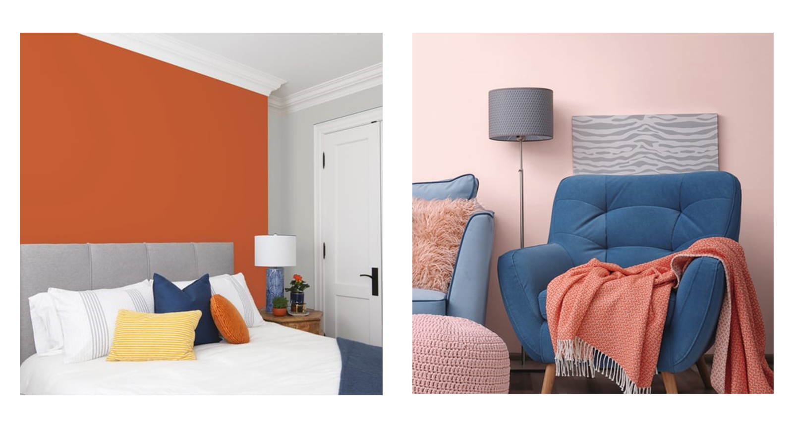
All designers know that any colour can be made to look a certain way with props and lighting. Consequently they cannot trust presentations of colour that are done within a room-set format where all the components within the set are manipulated to look a certain way.  Some of these images even have the give-away harsh edge-contrasts that are sure sign of a photoshopped in “painted wall”. The format is very much a retail approach that is extensively used for (supposedly more gullible?) consumers. Colour itself cannot be assessed via a screen, as screens will render the colour differently. The only rendition that will give a more accurate feel of how the colour performs within a space is to see it in that space.

For a paint product the colour needs to be shown in a real setting adjacent to other in-situ items such as doors, windows, furniture and flooring. The paint product needs to be shown on different planes, not just an elevation and genuine lighting will create shadowed areas, not a flat, blanket illumination.

Summary

So, to sum up here is a bullet list of the points made above.

Well-presented primary images for a creative specifier audience will be:-

  1. An image of the product only – no background distractions or styling
  2. A single representation of the product (not groups)
  3. High-quality images, clear, focussed and showing the entire product
  4. Not contain any graphics or text
  5. Stable, readable formats – no transitions when hovering over the image
  6. Consistently presented
  7. Always be accompanied by name, product codes and product details
  8. Avoiding retail-style presentation, no prices shown with images
  9. Truthful representation of what you sell – genuine colours and finishes
  10. In-situ, real-life images, not prop-styled room-sets